Blog

  • ‘El pi de Son Boter’ stone litho print

    ‘El pi de Son Boter’ stone litho print

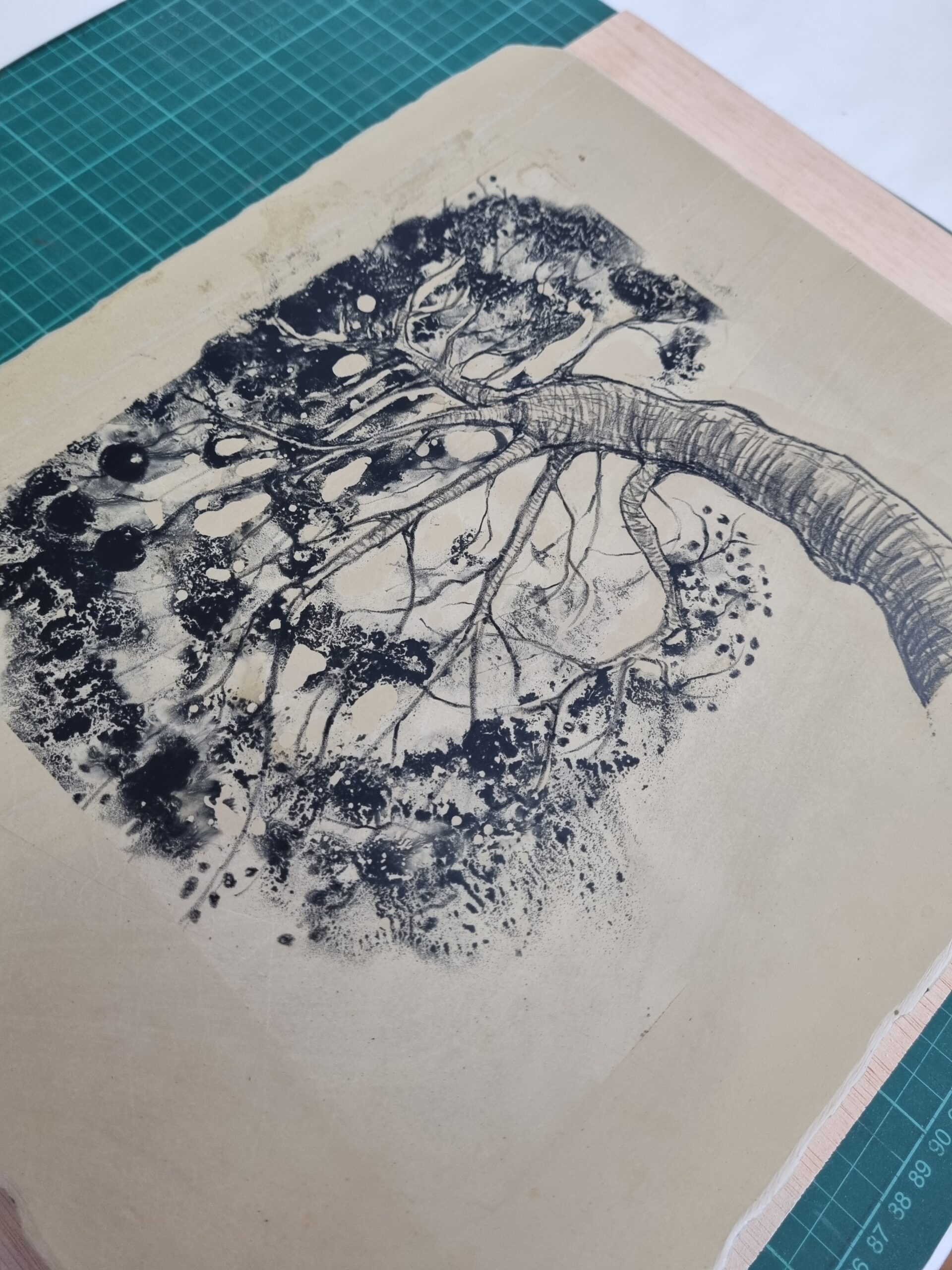
    For my first attempt at stone lithography, I decided to draw inspiration from the immediate surroundings of the printmaking workshop (just like I did for the mokuhanga workshop previously). The Son Boter possessió next door sits in the shade of some twisted, gnarly pins blancs (Aleppo pines, Pinus halepensis), with interesting lines and textures.

    Following a rough sketch, I drew the tree directly onto the stone with the aim of creating a bit of movement and energy. Once I had an outline I was happy with, I set to work with a black lithographic pencil to define the lines and form of the trunk and branches.

    I then painted on gum arabic to stop out areas of white and protect other parts of the drawing, before applying lithographic tusche and alcohol to achieve a different texture for the pine needles. The interaction between the tusche and the alcohol was mesmerising, and it’s this ‘giving over control’ to the materials for unexpected results that I love about printmaking.

    The developed image had some lovely effects that couldn’t be seen at the drawing phase, and which only appeared once the stone had been prepared for printing. This was down to how the grease moved around the plate (due to the alcohol) and penetrates the stone, even if it’s not visible to the eye. This was a very happy accident, as it added to the sense of movement I was hoping to achieve.

  • Lithography with Elena Carrasco

    In July 2024, I returned to Joan Miró’s printmaking workshops (at the Fundació Miró in Palma, Mallorca) to try my hand at stone lithography and aluminium-plate lithography, led by Spanish artist and printmaker Elena Carrasco.

    After studying fine art, Elena decided to focus on printmaking techniques, focusing on lithography specifically. After studying at the Tamarind Institute in New Mexico, she returned to Spain and finally set up her own lithography studio, La Litográfica, in Madrid.

    During the nine-day course, Elena introduced us to lithography on both stone and aluminium. We learnt about the history and theory behind the technique, and then applied our newly acquired knowledge to reproduce our own works on both surfaces.

    The amount of information and the steps involved (lithography is very process heavy, as it turns out) were quite overwhelming to start with. But as we put into practice everything we’d been taught, it all started to come together.

    It was also very special to use the massive but beautiful French wooden lithography press that Miró himself used to print with. The lithographic stones have a wonderfully tactile nature, edges stained with ink as a physical reminder of the artists that have used them before (even though the image has long been removed).

    We discovered that lithography is also a real team effort, from reminding each other of the next step to helping keep the stone damp while inking up between prints. The other thing I’ve loved about both courses I’ve now been on here is the truly supportive and encouraging atmosphere, thanks to both other participants and the course leaders.

    My next posts will reveal what beginner’s luck (and first-class teaching!) helped me to create using stone lithography and aluminium lithography techniques.

  • Exploring landscapes in charcoal

    A Domestika course by Laura McKendry that I recently completed started me off with charcoal. Pastels were one of the first materials I started drawing with when I was little (my mum had a stash that she let me use), but I hadn’t really used charcoal much.

    While the course focused on animals (there’ll be a post on that…), I quickly decided charcoal in all its forms was something I really enjoyed: messy, workable, flexible, versatile. And also very portable, not needing much space (or being heavy) for carrying along.

    We live near the finca pública Galatzó, and the boys and I love going hiking there. It’s possibly our favourite place on the island, and just on our doorstep. I also like to trail run, and started carrying a little homemade concertina book with me, along with a stick of willow charcoal, a Tombow eraser and a charcoal pencil (which neatly fit into my trail vest).

    As well as a few mid-run sketching stops, I’ve been doing a few small landscape studies around where we live, although I’m nearly always drawn (no pun intended…) towards views of Galatzó, which forms the backdrop of our local countryside.

    Although the studies often end up getting a bit smudged on the jog or walk back home (all adds to the story of the drawing, and I can always rework them), I’ve loved the effects and experimenting with this material. I’m also discovering that it’s helping me to move away from detailed, realistic drawings, towards capturing a more relaxed response to place.

  • Collagraph of a Mallorcan ‘ferreret’

    Following my first attempt at creating a collagraph plate, I decided the next print would be of an endangered ‘ferreret’ (well, two), which is a tiny (max. 4cm long) frog endemic to Mallorca.

    It exists only in the Serra de Tramuntana mountains and represents the struggle of local fauna to survive in the face of invasive species and other significant threats to their habitat.

    One of the challenges of this block was creating the markings found on the frogs’ skin. As I had no idea whether my approach would work, it was (again) pretty exciting to pull the print and see what the result was.

    On the first print, there were a few mall shellac shards around the image, so I either painted the coats too thick or the pressure was slightly too high. But I was otherwise really happy with how it turned out.

  • First attempt at a collagraph

    After my collagraph tutorial with Marian Haf, I couldn’t wait to have a go at putting into practice all the steps she’d explained. Naturally, my chosen subject was a chicken (new arrivals in the garden at home).

    The photos below show each stage of creating the collagraph plate, including the initial drawing, scratching details into the mountboard, sealing the plate with shellac, inking up and a resulting early print.

    As well as printing a lovely one-colour version in Prussian Blue (a favourite colour), I also had a go (under Julio’s guidance) at creating a two-colour version using the à la poupée technique. This uses a ball of fabric to add different colours to a single intaglio plate.

    It was intriguing and exciting to peel back and reveal the first print after putting it through the press, as I had no idea what to expect. But I was really pleased with the result and loved the idea of using simple (and relatively ‘safe’) materials to create the plate.